

Google shipped dashboards inside GA4 on September 9, 2026, which removes the main reason search teams kept a second reporting tool open. This is the build guide: one dashboard, twelve cards, empty canvas to published report.
It assumes you have Editor access to a property with at least 30 days of history, and that you have never opened the dashboard builder before. You will not need Looker Studio, BigQuery, or a paid BI tool.
What you will have when this is done
Item | Detail |
|---|---|
Deliverable | A 12-card dashboard published to the Reports left navigation |
Built for | Whoever asks "how did we do last week" and currently gets a screenshot |
Time | 45 to 60 minutes for the first build |
Prerequisites | Editor or Administrator role, 30+ days of data, a scope decision |
Done when | 12 cards placed, dashboard published, 2 cards reconciled in Explore, every card has an owner |
That last row is the one people skip. A dashboard is not finished when it looks right. It is finished when someone has checked that two of its numbers survive contact with a second tool.
Before the first card: access, scope, and three limits
Confirm three things before you open the builder.
You need Editor or Administrator. Viewers can read a published dashboard but cannot create or publish one. If you are on a client property with view-only access, this walkthrough stops at the access check.
The property needs roughly 30 days of data, because a score card only displays a percentage change when a comparison period is applied. Compare against a period with no data and you get a spike that means nothing.
Then decide the scope and write it down somewhere. Does this dashboard describe the entire property, or a subset you already track elsewhere? Every number on the page inherits that answer, and a reader who assumes the wrong scope will misread all of it.
Three limits decide what you can and cannot put on the page:
- 15 cards on a standard property, 30 on a Premium property.
- Publishing shares the dashboard with the entire property. Google's wording is blunt: all published dashboards are shared with the property. There is no per-audience setting.
- No segments on cards, no API, and no card-level comparisons. There is an Add filter control in the dashboard toolbar that scopes the whole page, but you cannot give a single card its own segment. That distinction shapes the AI band below.
If the dashboard option is not in your property yet, the rollout is gradual and there is nothing to configure. For the fuller read on what shipped and where these limits came from, that analysis is already up on the blog.
Build in reading order, not in order of importance
Here is the idea the rest of this guide depends on.
A dashboard gets read the way a page gets read. Top-left downward, in about forty seconds, before the reader decides whether to keep looking. So you place cards in the order the reader's questions arrive, not in the order your team happens to care about them.
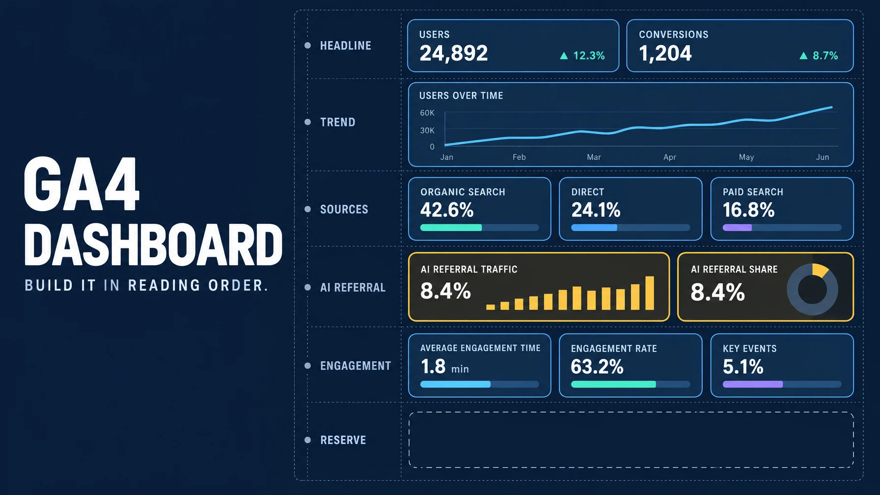
Five bands, plus one slot held in reserve:
Band | The question it answers | Cards |
|---|---|---|
1. Headline | Are we okay? | 2 score cards |
2. Trend | Which way is it moving? | 1 line chart |
3. Acquisition | Where did the traffic come from? | 3 table and bar cards |
4. AI referral | Is anyone arriving from an AI answer? | 1 donut, 1 table |
5. Engagement and leak | What did they do, and where did they stop? | 1 funnel, 2 supporting cards |
Reserve | Whatever gets asked in week two | 1 empty slot |
Twelve cards against a ceiling of fifteen. The reserve slot is the point of the whole exercise, and I will come back to it.
Band 1 and 2: the headline and the trend
Cards 1 and 2: two score cards
Put Sessions, Total users, and Engaged sessions on the first card. Put Key events and Key event rate on the second. Apply a date comparison to both. Score cards are the only card type that renders the percentage change, and it appears against the comparison you set.
Two cards rather than four, because the percentage change is applied at the card level. Metrics that share a comparison logic belong on one card. Metrics that need different baselines do not.
Check it: the comparison period belongs in the card title. "Sessions vs previous period" is readable. A bare "Sessions" next to a green arrow is not, because the reader supplies their own assumption about the baseline and they will guess wrong.
If a metric shows a dash: the property usually has no data for it. Revenue on a site without ecommerce is the common case. Swap in a metric the property actually collects instead of leaving a broken card on the page.
Card 3: one line chart
Sessions over time, broken down by Session default channel group.
Check it: set the granularity to weekly unless you genuinely have enough traffic to read a daily line. Daily granularity on a low-traffic site produces a sawtooth that invites stories the data does not support.
Band 3: where the traffic came from
Cards 4 through 6
A table of Session default channel group with Sessions, Engaged sessions, and Key events. A table of Landing page with Sessions, Engagement rate, and Key events. A bar chart of your top source and medium combinations by sessions. Sort all three by sessions, descending.
Check it: sort by the metric that matters, never alphabetically. An alphabetically sorted channel table puts Direct at the top and buries the answer.
This is the band where cardinality bites. A table of full URLs with query strings will paginate forever and read as noise. If your card exposes a row limit, cap it at ten. If it does not, drop down a level of granularity: Landing page instead of full URL, channel group instead of every individual source.
Band 4: the AI referral band
This is the band most teams leave off, and in 2026 it is the one that earns its space.
Cards 7 and 8
A donut chart of Sessions by Session default channel group, and a table of Session source with Sessions, Engaged sessions, and Key events.
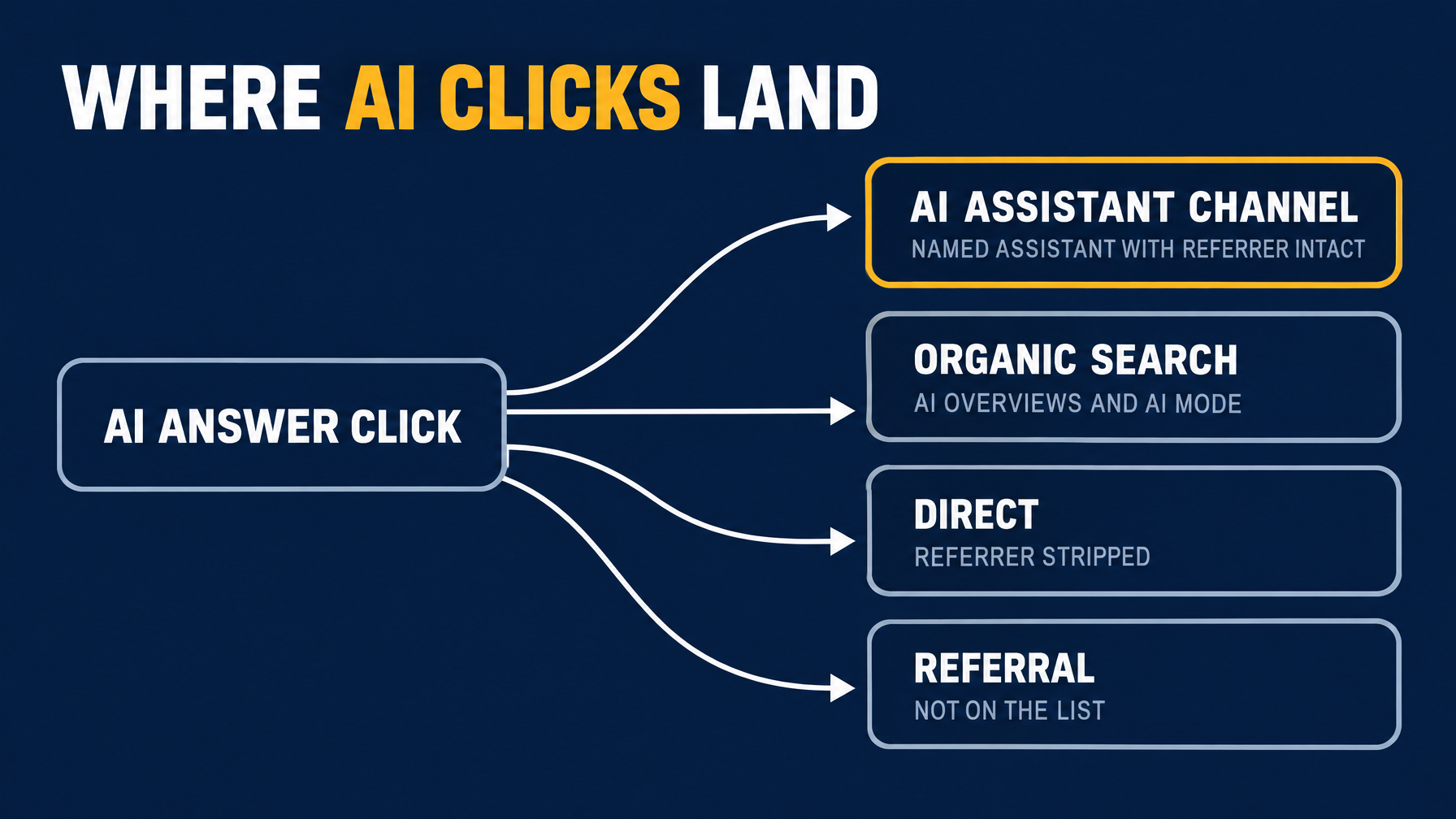
Two cards, not one, because they answer different questions. The channel group tells you whether an AI Assistant slice exists next to Organic Search, Direct, and Referral. The source table breaks that slice into named platforms, and it is the card you will actually read.
Both cards are buildable because Google shipped the plumbing in two steps this year.
On May 13, 2026, GA4 added an AI Assistant channel to Default Channel Group. Visits where the referrer matches a recognized AI assistant get the medium value ai-assistant, land in the AI Assistant channel, and carry the campaign name (ai-assistant). The release names ChatGPT, Gemini, and Claude as examples, and Google has not published the full recognized list, so treat any list you find as partial.
On June 11, 2026, Source Group cleaned up the per-platform side. The same platform arrives under different source strings, and Source Group collapses them into one clean value per platform. Google's own example shows the shape of the problem: %instagram% and ig both become Instagram. That same release added built-in grouping for ChatGPT (OpenAI) and Perplexity, which is why this card resolves to a readable row instead of a domain list. Source Group is populated retroactively, so the day you build the card you can read the past too.
Check it, and this matters more than any other check on the page. Read the AI Assistant number as a floor, never as a total. Three separate things suppress it:
- AI Overviews and AI Mode are not in this channel. Those clicks arrive from a Google search results page, so GA4 classifies them as Organic Search. For many sites Google's own AI surfaces are the largest AI referrer of all, and they are quietly sitting in a different slice of your donut.
- Referrers get stripped. Someone who copies a link out of a chat window, or opens it from an app that drops referrer data, lands in Direct with no trace of where they came from.
- Recognition is a list, not a rule. The channel matches named assistants. Anything not on the list falls through to Referral or Direct.
If every AI row reads zero: check two things before drawing a conclusion. First, confirm the AI Assistant channel exists in your property at all, because both features have been rolling out gradually. Second, check whether AI crawlers can actually read your pages, because a page a crawler cannot fetch will never appear in this band no matter how well it ranks.
One structural note. You cannot build an "AI traffic" score card for the top of the page, because segments are not supported on cards. That is why this band sits in the middle as dimensions a reader scans rather than at the top as a single headline number. If you need the AI split as a headline figure, that is an Explore report, not a card.
Band 5: engagement and the leak
Cards 9 through 11
A funnel chart for your main conversion path. A table of Landing page with Engagement rate and Average engagement time. A bar chart of Sessions by Device category.
Check the funnel against reality once. Funnel logic has to match how the site actually records the steps. A funnel built on an event that fires on page load rather than on the action will report a drop-off that does not exist. Open it in Explore and confirm the step counts before you trust the shape.
Check card 10 for the quiet failure. Engagement columns are how you catch the case where traffic went up, conversions went up, and the increase came entirely from pages that do nothing. Sessions alone cannot tell you that.
The card you leave empty
Card 12 stays blank.
In the first month, someone will ask for a cut that is not on the page. A brand against non-brand split, a country view, one campaign. With a free slot you add a card in two minutes. Sitting at fifteen, you either delete someone else's card or start a second dashboard, and both of those are worse than leaving one slot open from the start.
Assembling it on the canvas
Open Reports from the left menu, then click + Create at the top of the Report left navigation and choose Dashboard. The same menu also carries the older Detail report and Overview report entries, which are the legacy custom-report types rather than dashboards. Pick the dashboard.
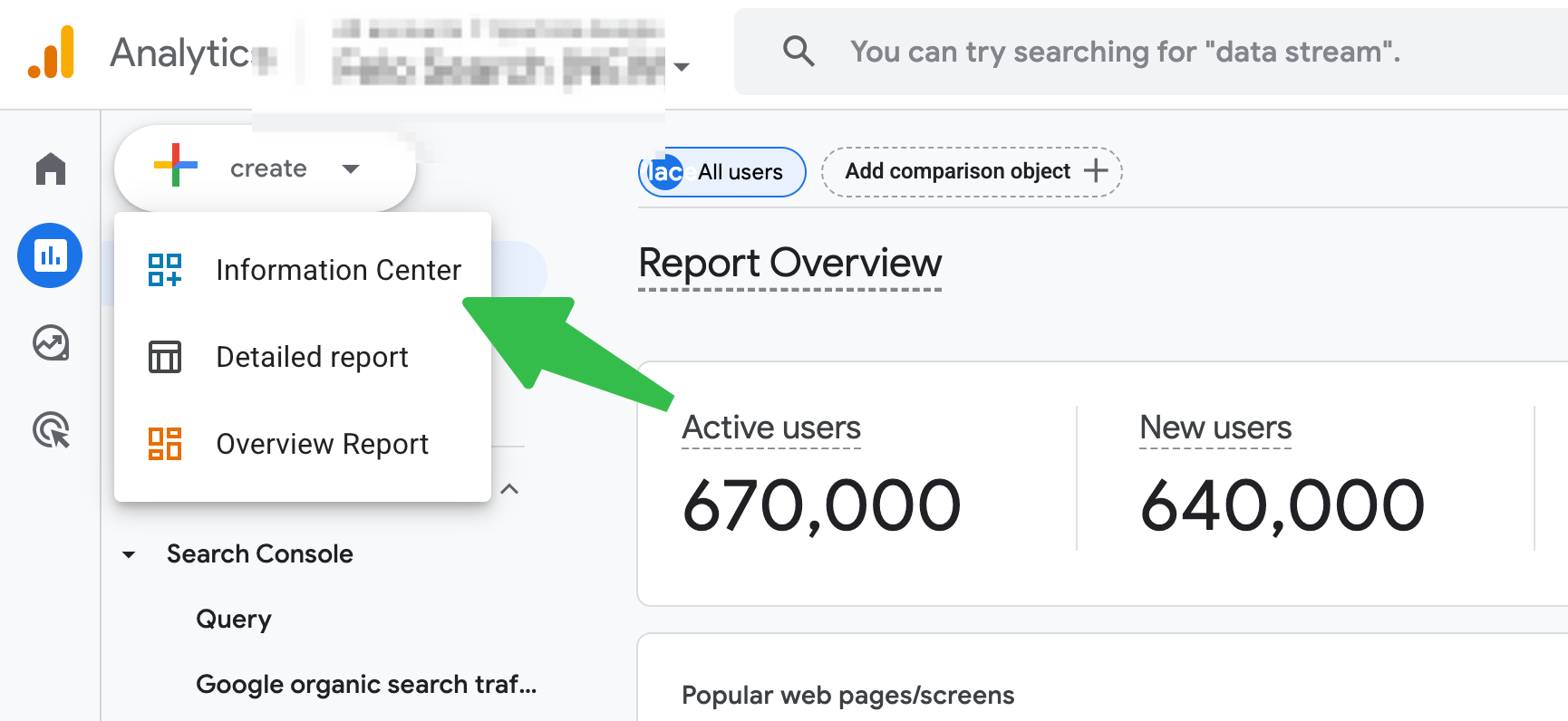
Once the canvas is open, the toolbar across the top gives you + Add chart, an Add filter control that scopes the whole page, the date range selector on the right, and Reset. Save sits in the top-right corner.
- Add a chart. Either click + Add chart and pick a type from the menu, or drag a visualization type straight onto the grid.
- Drag dimensions and metrics from the Data panel on the right onto the chart you just placed.
- Select a card and adjust what it shows in the right panel.
- Move and resize on the grid until the bands read in order.
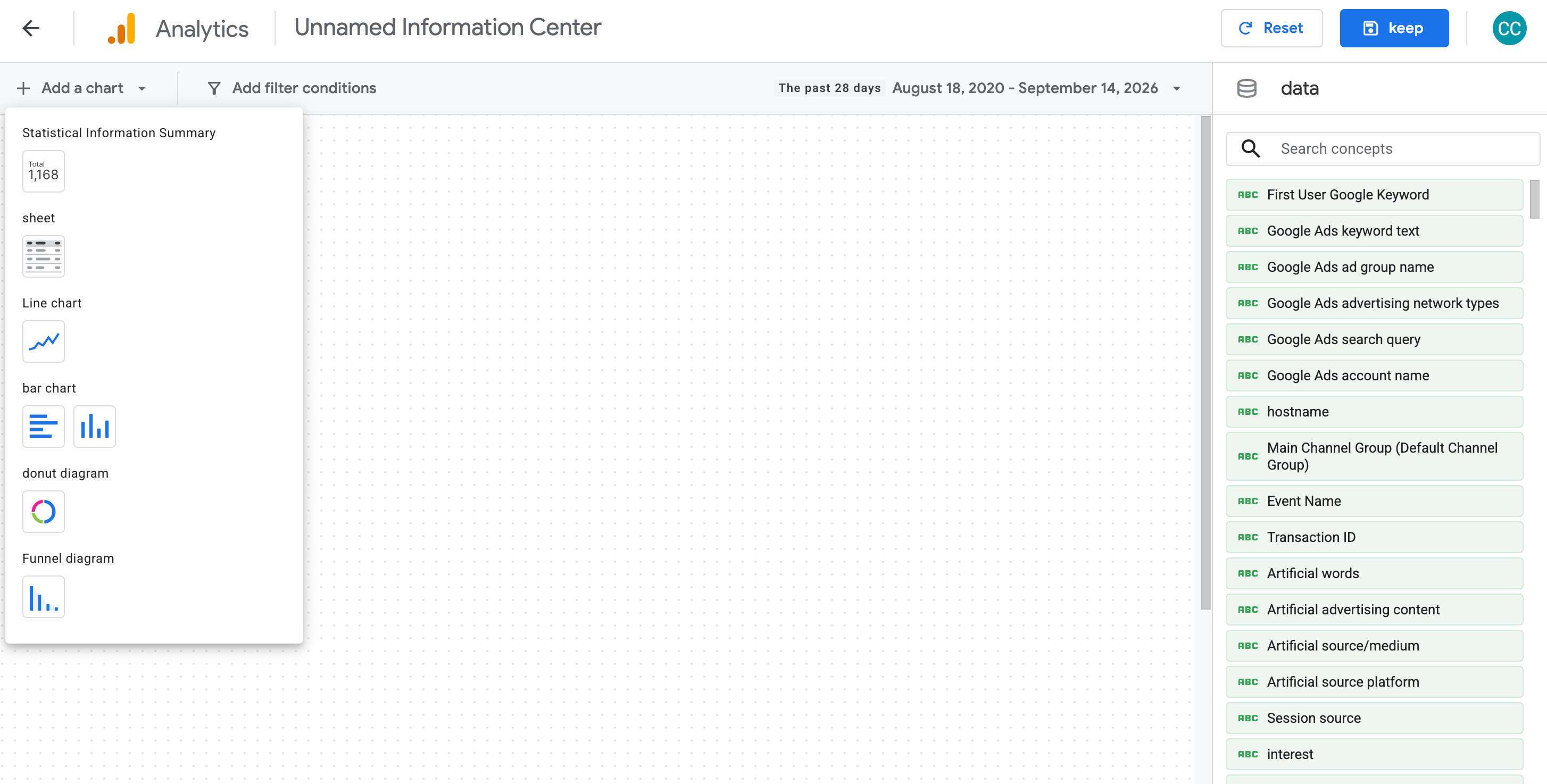
The six types are score cards, table charts, line charts, bar charts, donut charts, and funnel charts. Table charts render shaded bars and paginate on their own, which is why they carry the acquisition band. Line charts take daily, weekly, or monthly granularity.
To reopen a dashboard later, select it in the left navigation and click the Edit icon. There is no separate builder URL to bookmark.
Check it: size the page so the headline band reads without scrolling at a laptop width. If the top two cards need a scroll to be seen together, they are not a headline band.
If a chart refuses the metric you drag onto it, the metric is not compatible with that dimension. Change the chart type rather than dragging harder. A count metric dropped onto a dimension that expects a rate simply will not land.
Verify before anyone reads it
The dashboard is a reading surface. Explore is the measurement surface. Before you hand the link to anyone, reconcile two cards against Explore.
Pick the two that carry the most risk: one score card, because that is the number someone will quote in a meeting, and one table chart, because that is the list someone will act on.
If the totals match, you are done. If they do not, the cause is almost always one of these:
Symptom | Likely cause | What to check |
|---|---|---|
Small, consistent gap on every card | Time zone or date-range boundary | The property time zone, and whether the comparison window is identical in both places |
One card off, others fine | Dimension scope mismatch | Session-scoped and event-scoped dimensions do not count the same thing |
Table totals look low | Row limit or thresholding | Whether the card is capping rows before it sums |
Numbers differ by a wide margin | Different data source entirely | Whether the Explore report is pointed at the same property |
One more check that is easy to forget. Confirm that the person you are sending the link to sees the same rows you do. Because dashboards are shared at property level, a viewer with narrower data access sees a smaller picture than the one on your screen.
Publish, and the part you cannot take back
Save and Publish are two separate actions, and the gap between them is the only privacy control you get. Save keeps the dashboard in the library. Publish is what puts it in the Reports left navigation, where anyone with property access can open it.
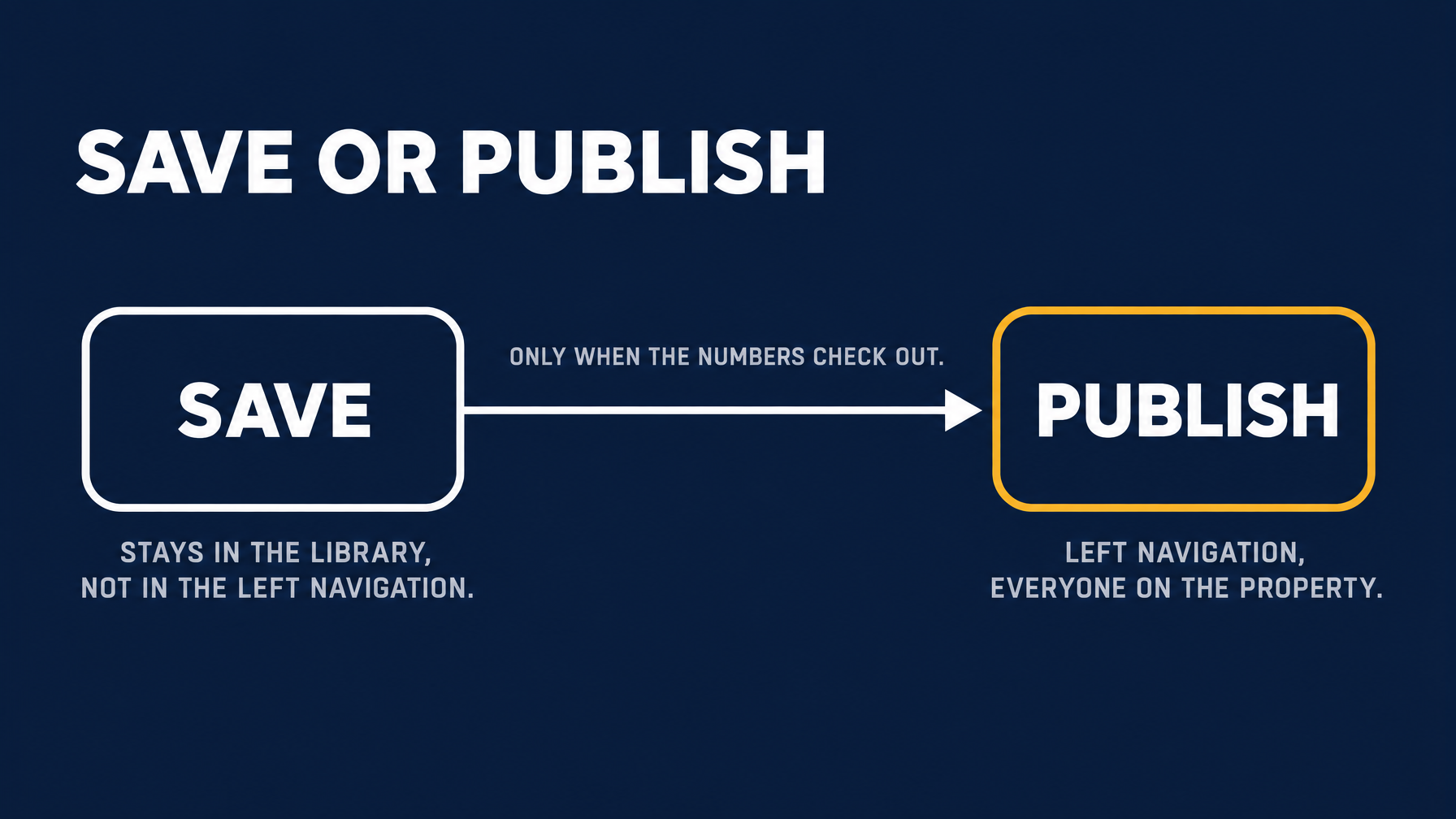
So the order matters. Build it, save it, reconcile the two cards as described above, and publish last. A saved dashboard that you have not published stays out of the left navigation, which is exactly what you want while a page full of half-checked numbers exists.
Once published, there is no per-audience setting. Every person with access to the property can see it, including clients, contractors, and the agency that still has a login from two years ago. Later saves update the same page in place rather than versioning it, so a change you make mid-edit can be live for them the moment you save.
If you published before the numbers were checked, edit immediately rather than waiting for the end of the week. Select the dashboard in the left navigation and click the Edit icon; cards can be removed or replaced after publishing. What you cannot do is make the page invisible to someone who already has property access.
Keeping it alive
Two passes, and then it is on a schedule.
In week one, ask the intended reader one question: what did you do differently because of this page? If they cannot answer, the dashboard is decoration, and the fix is to cut cards rather than add them.
At day thirty, go card by card and ask whether each one changed a decision in the past month. Delete the ones that did not, which frees slots for the next thirty days. Re-check that the AI band still resolves to clean Source Group values, since coverage is still expanding. And re-label any comparison that has drifted, because "vs previous period" means something different every month even though the label never changes.
FAQ
Can I build one dashboard per client on a single property? Not as published pages. A published dashboard is shared with the whole property, so a client-facing view and an internal view on the same property are visible to everyone with access. You can keep several saved but unpublished dashboards in the library. But the moment one of them needs to live in someone else's left navigation, it is visible to the whole property. If the audiences genuinely differ, the properties have to differ.
Can I copy a dashboard to another property? Not programmatically. There is no API support for dashboards at launch and no documented export, so rolling the same structure out across many properties is manual work. If you maintain twenty client properties, decide up front whether you build it by hand or keep that reporting in an external layer.
Why does the AI Assistant card look so small compared to what I see in ChatGPT referrer logs? Because the channel only counts sessions where the referrer survived the trip. Google's own AI surfaces report into Organic Search, apps that strip referrers land in Direct, and only named assistants are recognized. The card measures confirmed AI referrals. It does not measure AI influence, and the two numbers are not close.
Why does one card show a percentage change and another does not? Comparisons are applied at the card level. A score card shows a percentage when a comparison is set. Table, line, bar, donut, and funnel cards do not carry the same per-metric comparison, so the change has to come from somewhere else on the page.
Do I still need Explore? Yes, for anything that needs a segment. Segments are not supported on dashboard cards at launch, so a brand against non-brand split, or any card-level filtered view, still starts in Explore. Keep the dashboard as the page people read every week, and Explore as the place you go when a number needs defending.
Author: Martin Hayes, GEO Playbook Builder for 200+ Execution Checklists at Auspia. Martin writes step-by-step operating guides for teams building search and AI visibility workflows.