

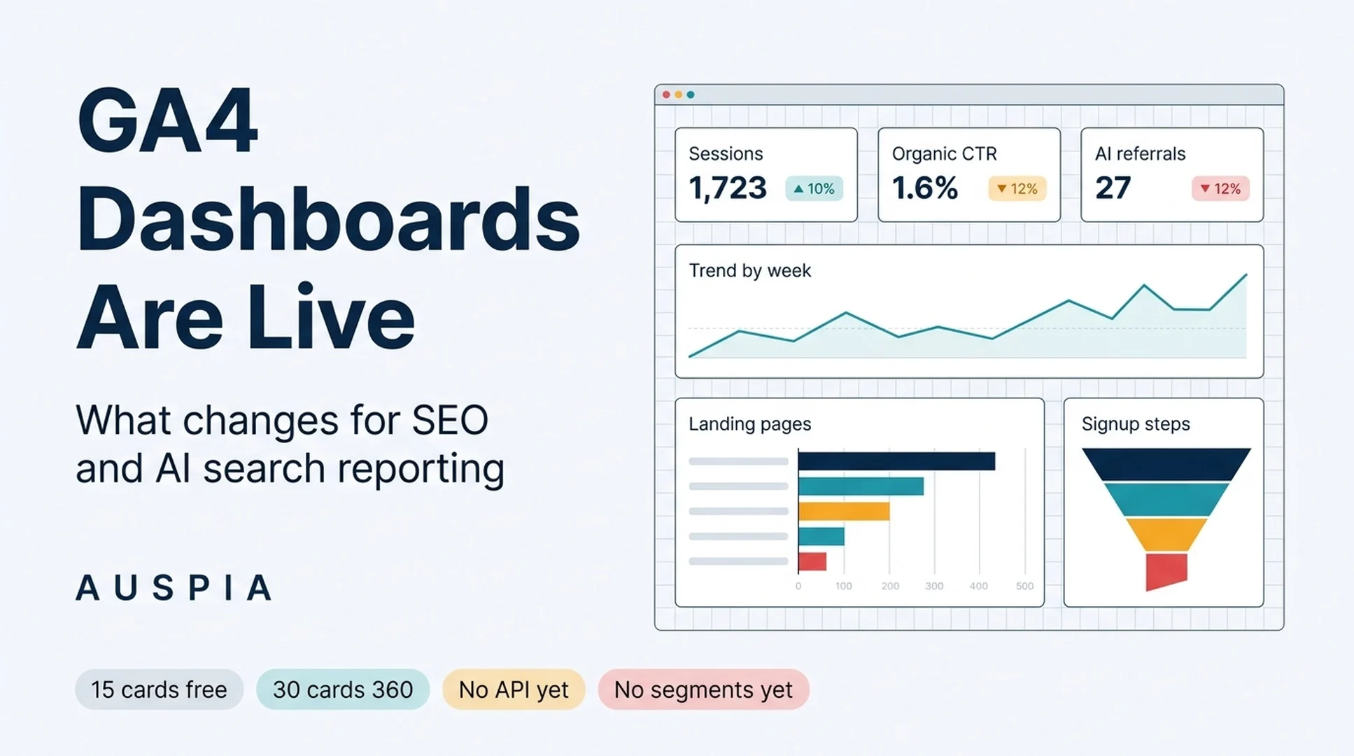
Google Analytics now supports custom dashboards inside the product. The feature landed in the "What's new in Google Analytics" release notes on September 9, 2026, and it moves a job that search teams have been doing in Looker Studio, spreadsheets, or a paid BI tool into the GA4 interface itself.
The short version, before the details:
- What shipped: a grid-based dashboard canvas inside the Reports area of Google Analytics, where you drag visualization cards and then drag dimensions and metrics onto them.
- Where to find it: Reports, then Create, then Dashboard. Editor or Administrator role is required to build and publish. Anyone with access to the property can view a published dashboard.
- Why search teams should care: reporting stops being a separate tooling project. The trade-off is that dashboards inherit GA4's own constraints, and three of those constraints matter a lot.
- The reality check: standard properties cap out at 15 cards per dashboard (30 for Premium), published dashboards are shared with the whole property, and API support, segments, and card-level comparisons are not supported.
That last line is the one to read twice. Everything else about this launch is genuinely useful, but the missing pieces decide what you should and should not build on it.
What Google shipped, in Google's words
Google's help documentation describes the dashboard as a way to "create custom visualizations to quickly pull actionable insights from your Google Analytics data, all in a single, consolidated page."
The documented features are worth reading literally, because each one answers a specific complaint:
- Consolidated, single-page KPI view. Cross-functional metrics live in one interface, so you stop clicking between Reports sections to see core business KPIs.
- Grid-based canvas layout. Cards are placed and resized on a grid, with manual alignment and support for custom dimensions.
- Drag-and-drop. You create a chart by dragging dimensions and metrics onto the canvas rather than configuring a chart type in a form.
- Direct publication to left navigation. When you save, you can publish the dashboard straight into the Reports left navigation and skip the library step.
The build sequence is short: sign in, open Reports, choose Create then Dashboard, drag a visualization type onto the canvas, drag dimensions and metrics onto the chart, adjust settings in the right panel, save, and publish.
One governance detail deserves attention before anyone starts dragging cards around. Publishing a dashboard makes it visible to every user on the property. There is no private dashboard and no per-audience sharing at launch.
The six visualizations, and what each one is actually for
Google supports six card types. They are generic analytics primitives, but for a search team each one maps to a different reporting question.
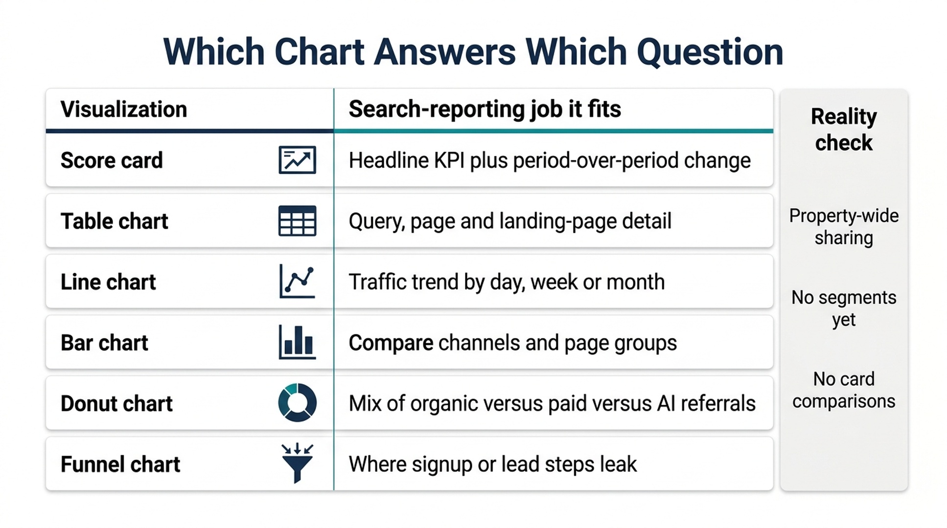
Six card types, six different jobs. Picking the chart before the question is how dashboards turn into decoration.
Visualization | Best used for | Watch out for |
|---|---|---|
Score card | Headline KPIs, with percentage change when a date comparison is applied | Change is only meaningful if the comparison period is stated on the dashboard |
Table chart | Query, page, and landing-page detail, with shaded bars and pagination | High-cardinality dimensions inflate the report and slow reading |
Line chart | Trend over time at daily, weekly, or monthly granularity | Daily granularity looks noisy on low-traffic sites; use weekly |
Bar chart | Comparing channels, page groups, or device categories | Long label sets need truncation or a top-N filter upstream |
Donut chart | Mix of organic, paid, direct, and AI referrals as parts of a whole | Hard to compare more than about five slices |
Funnel chart | Conversion steps and drop-off points | Funnel logic must match how the site actually records steps |
If you build nothing else, build one score-card row, one line chart, one table chart, and one funnel chart. That combination answers "how are we doing", "which way is it moving", "what exactly changed", and "where is it leaking".
The limits are the real story
Three limitations from the documentation will shape how you use this feature, and they are not cosmetic.
No segments. Segments are not supported on cards. That removes the single most useful filtering move in search reporting: comparing brand against non-brand, logged-in against logged-out, or pages that appear in AI answers against pages that do not. If you need those cuts, you are still building them in Explore or in a separate reporting layer. Treat the dashboard as a summary surface, not as the place where you answer segment-level questions.
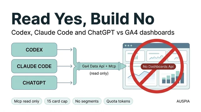
No API support. Dashboards cannot be created, read, or updated programmatically. Nothing about this is scriptable at launch, so no automated backup, no templated rollout across fifty properties, and no version control on the definitions. If your team publishes the same report structure for every client, you are still doing that work by hand.
Card ceilings and shared visibility. Fifteen cards on a standard property, thirty on a Premium property, and every published dashboard visible to the entire property. Both numbers push you toward one conclusion: a dashboard should carry an argument, not an inventory. A fifteen-card budget is generous if the cards are chosen, and cramped if they are accumulated.
A fourth practical limitation follows from the others. Card-level comparisons are not supported, so the score-card percentage change applies at the card level rather than per metric inside a multi-metric card. Keep one comparison logic per card and label it in the card title.
Where this replaces a BI tool, and where it does not
The honest comparison is not "GA dashboards versus Looker Studio, winner take all". The two tools are good at different stages of the same job.
Requirement | GA4 dashboards | External BI layer |
|---|---|---|
Time to first chart | Minutes, inside the tool | Setup, data source connection, styling |
Data freshness | Native, no connector | Depends on the connector and refresh schedule |
Mixed data sources | Not possible | Yes, GA plus CRM, ad spend, or rank data |
Segment-level cuts | Not supported at launch | Yes, with modeled or blended data |
Programmatic creation | Not supported at launch | Yes, through APIs |
Governance and sharing | Property-wide only | Role- and link-based |
Best for | The weekly operating view the team already checks | Board reporting, blended attribution, and anything automated |
A workable split: keep the dashboard inside GA4 for the numbers the search team reviews weekly, and keep the external layer for anything that blends sources or needs to be generated automatically. Do not duplicate both, or the two versions will disagree within a month and nobody will know which one is right.
A build order that survives contact with real data
Here is the sequence I would use on a property that already has Editor access and at least one year of history.
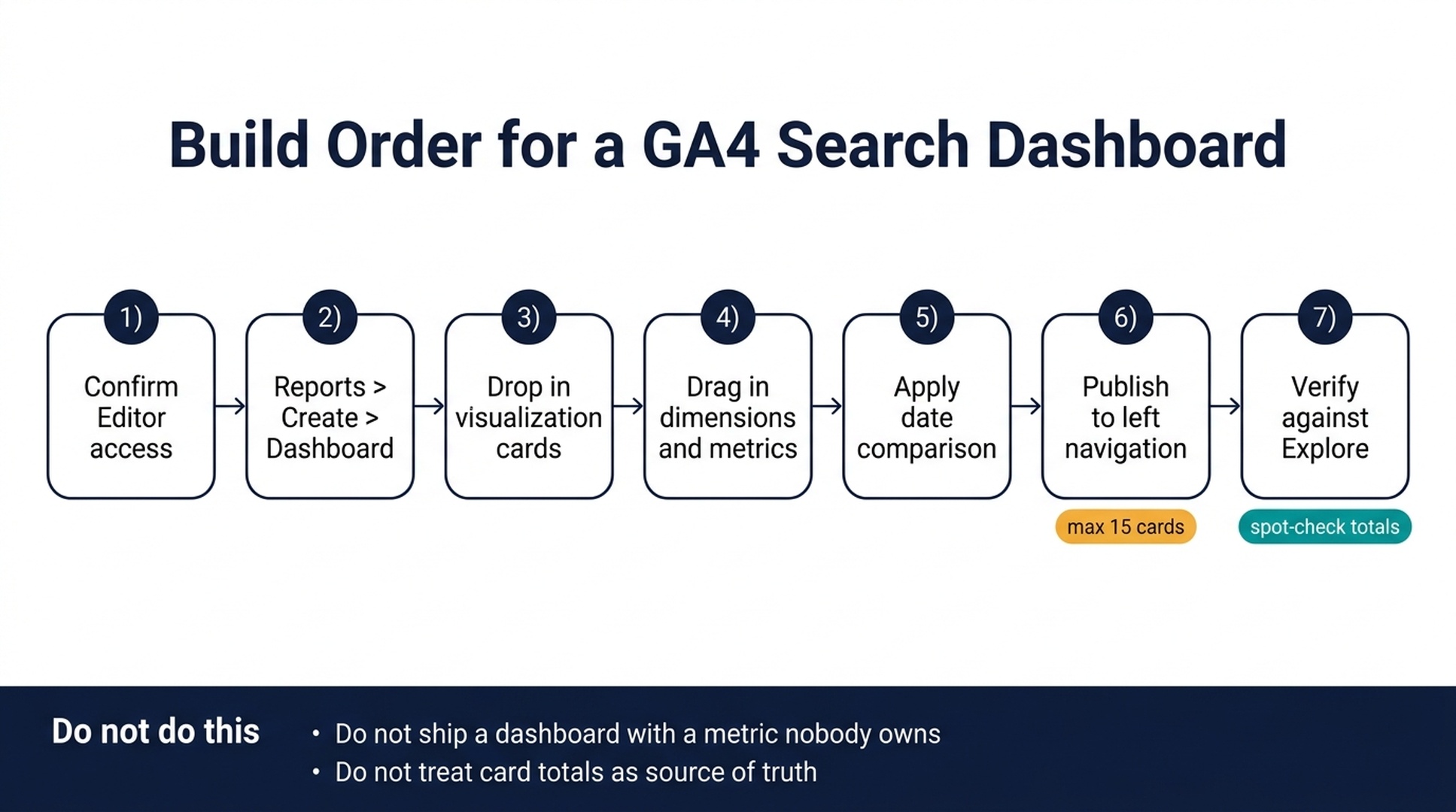
The build order is short. The steps that get skipped are the last two.
- Confirm access and scope. You need Editor or Administrator. Decide whether the dashboard reports on the whole property or on a filtered subset of traffic, and write that decision down, because it determines how every number gets read.
- Create the dashboard empty. Reports, Create, Dashboard. Do not drag a single card until you have written the four or five questions the dashboard must answer.
- Place the anchor cards. One score-card row for the headline KPIs, one line chart for trend. These two card types set the reading order for everything else.
- Assign dimensions and metrics deliberately. Primary channel group, session source and medium, landing page, and conversions cover most search reporting. Sort table charts by the metric that matters, not alphabetically.
- Apply and label the date comparison. Score cards only show percentage change when a comparison is applied, and an unlabeled comparison is worse than no comparison because readers assume the wrong baseline.
- Publish to left navigation. Publishing makes the dashboard available to the property, so publish the version that is ready to be read, not the version that is being built.
- Verify against Explore before you present it. Rebuild one or two cards as an Explore report and confirm the totals match. Dashboard cards are a reading surface; when a number drives a decision, confirm it in the exploration tool first.
Two habits to attach to this build order. Give every card an owner, because a metric nobody owns becomes a metric nobody defends. And keep the total card count well below the ceiling, because the fifteen-card limit is a design constraint that improves dashboards when you respect it early and a headache when you hit it at card sixteen.
Before you trust the numbers
A dashboard makes numbers easy to look at, which is exactly why it makes wrong numbers easy to look at too.
- Check the granularity. Daily line charts on a low-traffic site produce sawtooth patterns that invite false narratives. Weekly granularity usually tells the truth.
- Check cardinality. High-cardinality dimensions such as full URLs or search terms can overwhelm table cards. Google publishes separate guidance on cardinality, and it is worth reading before you add a detail card.
- Check the time zone and attribution model. Both are property settings, and both change the numbers on the card.
- Check that the recipient can see what you can see. Because dashboards are shared at property level, a viewer with different property access sees a different picture than you do.
Auspia's take
This launch is a real improvement, and it is also a narrow one. Google has solved the "I need a KPI page without opening another tool" problem, which is genuinely most of what teams ask for. Google has not solved the "I need segment-level, API-driven, multi-source reporting" problem, which is what serious search programs eventually need.
The right response is to treat GA4 dashboards as the operating view and to keep one separate surface for blended or automated reporting. Teams that try to force the new dashboards into both roles will hit the segment limit, the API limit, and the card limit inside one quarter and conclude the feature is worse than it is.
One consequence is easy to miss. Because the dashboard sits next to the data, the conversation shifts from "can we get this number" to "who is responsible for this number". That is a better conversation, and it is the one worth having while the feature is still new. If you want to know how much of your traffic is arriving from AI answer surfaces before you decide what belongs on the dashboard, split referral traffic by source in your own Analytics property first, then treat that split as a starting read rather than a final one.
What to do this week
- Open Reports and check whether the Dashboard option is available in your property. Rollout timing varies, so confirm availability rather than assuming it.
- Write the four questions your search dashboard must answer, then pick one card per question. If a question needs segments, mark it as out of scope for now.
- Nominate an owner for every card you keep. Delete the cards with no owner before publishing, not after.
FAQ
Do I still need Looker Studio? If your reports only use Google Analytics data, the built-in dashboards may be enough, especially for a weekly operating review. If you blend GA data with CRM, ad spend, or rank tracking, or you need role-based sharing, keep the external layer.
Can I build a brand versus non-brand dashboard? Not with segments, because segments are not supported on cards at launch. Use Explore, a separate property or data stream, or an external BI layer for that cut.
Will the feature be available in my property today? The help documentation and release notes are live, but rollout is gradual. Check Reports, then Create, to see whether Dashboard appears in your account.
The bottom line
Google Analytics dashboards remove a real piece of reporting friction for search teams, and they arrive with limits that are easy to state and easy to ignore. Build the small dashboard, respect the fifteen-card ceiling, keep segment-level and automated reporting outside it, and verify the numbers before anyone makes a decision with them.
Author: Leo Harrington, SEO Analytics Translator for 500+ Executive Reports at Auspia. Leo writes about turning search and AI visibility data into reports that executives actually read.