The practical answer
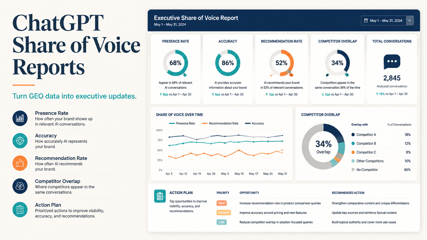
A ChatGPT share of voice report turns prompt-level GEO checks into an executive-friendly view of AI visibility. Instead of showing raw screenshots or one-off examples, it summarizes how often your brand appears, how accurately it is described, which competitors appear, which prompts drive gaps, and what content or evidence work should happen next.
For leadership, the report should answer four questions: Are we visible? Are we described correctly? Who is winning the answer set? What should we fix this month?
A good report is not a giant prompt dump. It is a decision document that connects AI answer data to content, SEO, brand, product marketing, and revenue priorities.
What share of voice means in ChatGPT GEO
In traditional marketing, share of voice often measures how much visibility a brand has compared with competitors across media, search, social, or ads.
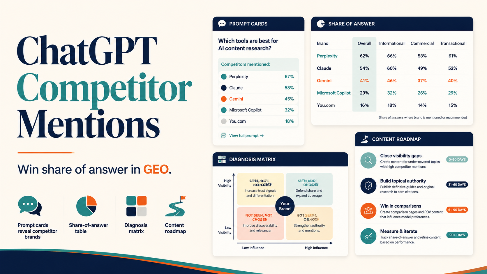
In ChatGPT GEO, share of voice measures how often and how well a brand appears across a defined prompt set.
It should include:
- brand presence
- competitor presence
- answer position or prominence
- description accuracy
- recommendation context
- evidence or citation presence
- sentiment or caveat language
- prompt category performance
This matters because a brand can be present but still weak. For example, ChatGPT may mention your brand but describe it with old positioning, omit proof, or recommend competitors more strongly.
Start with a stable prompt library
A share of voice report is only useful if the prompt set is consistent.
Use prompt groups such as:
| Prompt group | Example |
|---|---|
| Brand | What does [brand] do? |
| Category | What are the best tools for [category]? |
| Problem | How do I solve [problem]? |
| Alternatives | What are alternatives to [competitor]? |
| Comparison | Compare [brand] and [competitor] |
| Evidence | What proof supports [brand]? |
| Use case | What should [audience] use for [workflow]? |
For an executive report, 25-50 prompts is often enough to start. More prompts can help, but only if the scoring stays consistent.
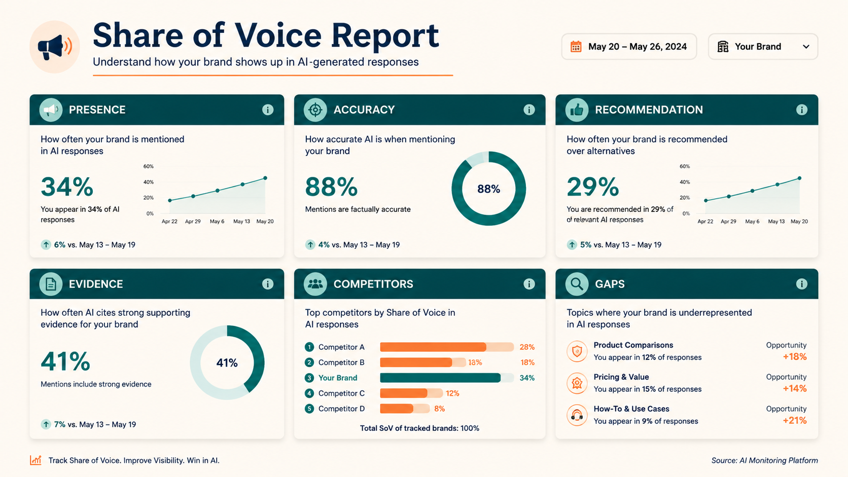
The metrics executives actually need
Do not overload the report with every detail. Use a small set of repeatable metrics.
| Metric | What it means | Why it matters |
|---|---|---|
| Presence rate | % of prompts where brand appears | basic visibility |
| Accurate mention rate | % of prompts where brand is described correctly | entity clarity |
| Recommendation rate | % of prompts where brand is recommended with context | demand capture |
| Evidence rate | % of prompts with proof, citation, or example | trust strength |
| Competitor overlap | competitors appearing in same prompts | market pressure |
| Wrong answer rate | prompts with outdated or incorrect descriptions | brand risk |
| Prompt gap count | important prompts where brand is absent | content roadmap |
These metrics make GEO understandable to non-specialists.
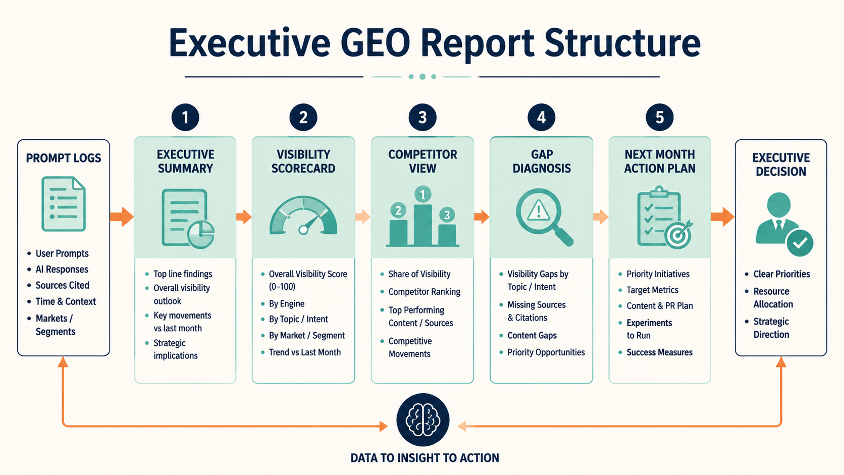
Build the report around decisions
A strong report should have five sections.
1. Executive summary
One paragraph and one scorecard.
Example:
This month, the brand appeared in 42% of monitored ChatGPT prompts, up from 35% last month. Description accuracy improved in brand prompts, but category and alternatives prompts still favor two competitors. The biggest gap is comparison content: the brand is rarely included when users ask for alternatives to [competitor].
2. Visibility scorecard
Show current metrics and month-over-month movement.
| Metric | Current | Previous | Change |
|---|---|---|---|
| Presence rate | 42% | 35% | +7 pts |
| Accurate mention rate | 76% | 68% | +8 pts |
| Recommendation rate | 21% | 18% | +3 pts |
| Evidence rate | 9% | 7% | +2 pts |
| Wrong answer rate | 11% | 16% | -5 pts |
Use directional data carefully. If the sample is small, label it as monitored prompt data, not market-wide truth.
3. Competitor view
Show who appears most often and where.
| Brand | Presence | Strongest prompt group | Weakest prompt group |
|---|---|---|---|
| Your brand | 42% | brand prompts | alternatives prompts |
| Competitor A | 68% | category prompts | evidence prompts |
| Competitor B | 54% | comparison prompts | use-case prompts |
| Competitor C | 37% | problem prompts | brand prompts |
This helps leadership see the market map.
4. Gap diagnosis
Turn data into causes.
| Gap | Likely cause | Fix |
|---|---|---|
| Missing from alternatives prompts | weak comparison footprint | build alternatives page |
| Vague descriptions | product page lacks clear category language | rewrite product definition |
| Low evidence rate | proof assets not connected | link case studies and review profiles |
| Competitor dominates use-case prompts | missing use-case pages | publish use-case pages |
5. Next-month action plan
End with 3-5 actions, each tied to a metric.
Example:
- Publish one alternatives page to improve alternatives prompt presence.
- Update product page definition to reduce vague descriptions.
- Link case study proof blocks from use-case pages to improve evidence rate.
- Refresh two review profiles with current category language.
- Rerun the same 40 prompts next month.
Visualize the data simply
Executives do not need raw prompt logs first. They need the pattern.
Useful visuals:
- scorecard dashboard
- competitor share-of-answer bar chart
- prompt gap heatmap
- accuracy trend line
- action priority matrix
- before/after answer examples
A report should still include the raw data appendix. But the first page should make the decision obvious.
How to avoid misleading reports
GEO reporting is still new, so teams need guardrails.
Use these rules:
- Keep the prompt set stable.
- Label the sample size.
- Do not claim market-wide certainty from 20 prompts.
- Separate brand presence from recommendation quality.
- Track accuracy, not only mentions.
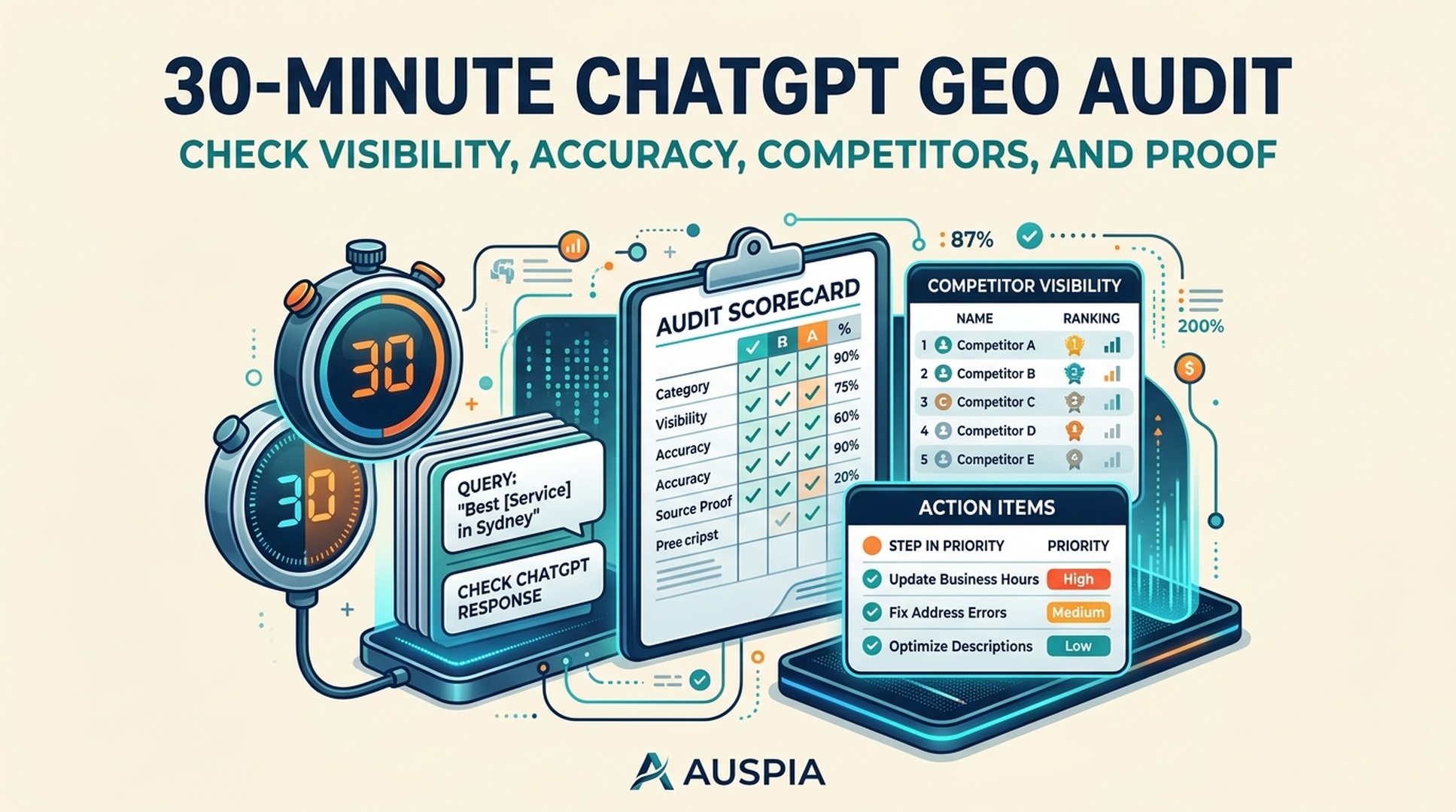
- Keep screenshots or answer logs for auditability.
- Note which AI system, date, and settings were used.
- Avoid cherry-picking only favorable prompts.
A credible report is more valuable than an exciting one.
Example executive summary format
Use this template:
This month, [brand] appeared in [X%] of monitored ChatGPT prompts. Visibility improved/dropped mainly in [prompt group]. Description accuracy is [high/medium/low], with the largest issue being [wrong/vague/missing context]. [Competitor] leads in [prompt group], likely because of [content/evidence/category] strength. Recommended action: [specific page/evidence/profile update] before the next measurement cycle.
This format forces the report to connect data to action.
What to include in the appendix
The appendix should include:
- prompt list
- date tested
- AI system and mode
- full answer excerpts or screenshots
- brand presence score
- competitor mentions
- accuracy notes
- evidence/citation notes
- recommended fix
Keep the appendix detailed enough that another person can review the scoring.
Common mistakes
Mistake 1: reporting only a single answer
One answer is anecdote. A report needs a defined prompt set.
Mistake 2: measuring mentions but not accuracy
A wrong mention can create risk. Accuracy matters as much as presence.
Mistake 3: mixing prompt groups without labels
Brand prompts, category prompts, and comparison prompts have different meanings. Segment them.
Mistake 4: hiding the action plan
A report that does not lead to page, evidence, or profile updates is just monitoring.
Mistake 5: overclaiming certainty
AI answers vary. Use clear wording about sample size and monitored prompt scope.
FAQ
What is ChatGPT share of voice?
ChatGPT share of voice measures how often and how well a brand appears across a defined set of ChatGPT prompts compared with competitors. It includes presence, accuracy, recommendation context, and evidence.
How many prompts should a report include?
Start with 25-50 prompts across brand, category, problem, alternatives, comparison, evidence, and use-case groups. Increase coverage after the scoring process is stable.
How often should executives see a GEO report?
Monthly is a good cadence for most teams. Weekly updates are useful during launches, repositioning, or major content sprints.
What is the most important metric?
Presence rate is the easiest to understand, but accurate recommendation rate is often more useful. A brand should appear in the right prompts with the right context.
What should the report recommend?
It should recommend concrete fixes: category pages, comparison pages, product page rewrites, use-case pages, case studies, review profile updates, technical crawl fixes, or citation-ready content.
Author: Leo Harrington, SEO Analytics Translator for 500+ Executive Reports at Auspia. Leo writes about reporting, dashboards, metrics that executives understand, and AI visibility measurement.