The short version
AI agents are starting to use websites the way people do: they look at the screen, choose a target, click, wait, type, and recover from mistakes. That changes what "good frontend UX" means.
For years, teams optimized pages for search crawlers, performance budgets, and human conversion. The next constraint is agent task success. If an AI agent cannot tell which element is clickable, whether a form submitted, or why a disabled button is disabled, it may loop, misclick, abandon the task, or give the user a bad answer about your product.
The good news is that agent-readable frontend work is not a separate dark art. It overlaps heavily with semantic HTML, accessibility, clean interaction states, and predictable layout. In other words: the web practices teams postponed for years are becoming growth infrastructure.
This is an AEO playbook for product, growth, and frontend teams that want their websites to work better for browser agents, AI assistants, and multimodal search experiences.
Why this matters now
Traditional SEO asked, "Can a crawler parse this page?" Modern AI search asks, "Can a model understand and cite this page?" Agentic browsing adds a third question: "Can an AI actually use this page to finish a task?"
A task might be simple:
- Find pricing for a team plan.
- Compare two products.
- Book a demo.
- Generate a quote.
- Download a report.
- Remove an item from a cart.
- Submit a support request.
If the interface is visually clever but structurally vague, an agent has to guess. A human can infer that a blue card is clickable. A model may see text, color, and spacing, but miss the action. A human notices a small spinner and waits. An agent may click again. A human can work around a sticky overlay. An agent may keep hitting a transparent wall.
This is why agent-readable frontend design belongs in the same conversation as SEO, GEO, accessibility, and conversion optimization. If AI assistants increasingly mediate product discovery and task completion, your interface is no longer only a human-facing surface. It is also a machine-operated workflow.
How AI agents see a webpage
Different agents work in different ways, but most browser-use systems combine a few signals:
| Signal | What the agent gets | Why it matters |
|---|---|---|
| Screenshot | The rendered pixels of the current browser window | Helps the model identify visible text, buttons, forms, cards, modals, and layout relationships |
| DOM structure | Elements, attributes, links, inputs, and hierarchy | Helps the agent separate real controls from decorative shapes |
| Accessibility tree | Roles, labels, names, states, and relationships | Often gives the cleanest machine-readable map of what each control does |
| Action history | Previous clicks, typed values, waits, and errors | Helps the agent decide whether to continue, retry, or recover |
| Browser automation layer | Click, type, scroll, wait, select, file upload | Executes the model's chosen action in the page |
A weak page forces the agent to rely mostly on pixels. A strong page gives it multiple ways to confirm the same decision: the button looks like a button, is coded as a button, has a useful accessible name, exposes its current state, and responds with clear feedback.
That redundancy is the point. Agent-readable UI is not about hiding special metadata for bots. It is about making the intent of the interface hard to misunderstand.
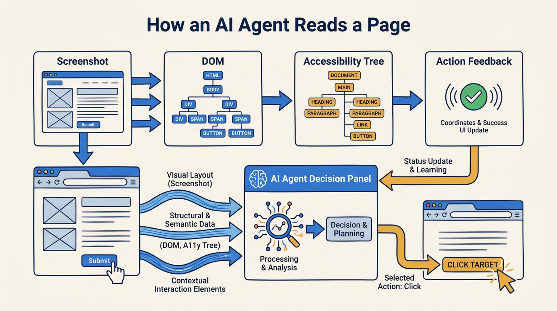
Caption: An agent-readable page gives the model both visual and structural evidence before it clicks.
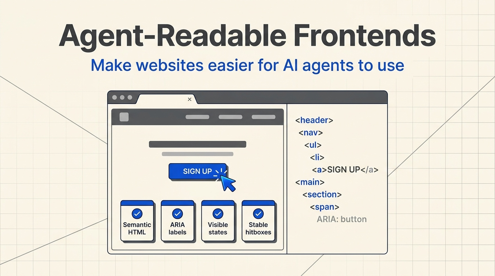
Principle 1: use semantic HTML before clever components
The fastest way to confuse an agent is to make everything a div.
A div with an onClick handler may work for a mouse user, but it throws away meaning. It does not tell the browser, a screen reader, or an agent whether the element is a button, a link, a list item, a menu option, or a tab. The visual model has to infer that from styling alone.
Prefer native controls wherever possible:
| Use case | Prefer | Avoid as the default |
|---|---|---|
| Navigation |
| Clickable |
| Form submission |
| Styled |
| Toggle |
| Icon-only element with no state |
| Selection |
| Custom dropdown with no keyboard support |
| Product card title |
| Entire card as one ambiguous click target |
This is not nostalgia for old HTML. Native controls bring keyboard behavior, focus handling, roles, and state semantics for free. Agents trained on screenshots and web interactions also see these patterns constantly, so standard controls reduce guesswork.
A practical rule: if a user can click it, tab to it, type in it, submit it, expand it, or select it, the element should expose that behavior in HTML, not only in CSS and JavaScript.
Principle 2: make labels explicit, especially for icon-only actions
Icon-only UI is where agents often become unreliable.
A trash icon might mean delete, clear, remove, discard, cancel, or empty cart. A magnifying glass might mean search, zoom, inspect, or open preview. Humans use surrounding context. Agents do too, but their confidence drops when the accessible name is missing.
Bad:
<button class="icon-button">
  <svg class="trash-icon"></svg>
</button>
Better:
<button class="icon-button" aria-label="Remove Acme Analytics from cart">
  <svg class="trash-icon" aria-hidden="true"></svg>
</button>
For repeated controls, include the object in the label. "Delete" is better than nothing, but "Remove Acme Analytics from cart" is much safer because it distinguishes one row from another.
The same applies to form labels. Placeholder text is not a label. Floating labels that vanish at the wrong time are risky. Each input should have a stable programmatic label, visible helper text when needed, and clear error messaging tied to the field.
Principle 3: treat focus, hover, loading, and success states as agent instructions
Agents need confirmation. They need to know what changed after an action.
Many modern websites are too subtle here. Buttons change by two color values. Focus rings are removed because they look "ugly." Loading happens silently. Toasts disappear before the agent's next screenshot. The result is a page that feels polished to designers but ambiguous to automation.
Use interaction states as plain-language signals:
| State | What to implement | What it tells the agent |
|---|---|---|
| Focus | Keep a visible | "This is the active control" |
| Hover / pointer | Use pointer cursor and visible hover state for clickable controls | "This element can be acted on" |
| Loading | Disable the trigger, show spinner or skeleton, update button text | "The action started; wait" |
| Success | Persistent confirmation near the changed area | "The previous action worked" |
| Error | Field-level message plus summary when needed | "Fix this specific input before retrying" |
Do not rely on animation alone. If a form submission starts, change the button text from "Submit" to "Submitting..." and expose aria-busy="true" on the relevant region. If results are loading, show where they will appear. If the action fails, keep the error visible long enough for the next agent step.
This helps humans too. The overlap is almost perfect.
Principle 4: keep the physical click target aligned with the visual target
Agents often choose coordinates based on what appears to be the center of a visible control. That gets fragile when the visual layer and hitbox layer drift apart.
Watch for these patterns:
- Invisible overlays that remain in the DOM after a modal closes.
opacity: 0elements that still intercept clicks.- Transformed elements where the visual center is far from the clickable area.
- Tiny icon buttons with a small hitbox inside a large visual card.
- Sticky headers that cover anchors or form fields after scrolling.
- Nested click handlers where clicking a child triggers the parent action.
If a modal is closed, unmount it or set it to display: none and remove it from the interaction path. If an overlay is decorative, use pointer-events: none. If a product card contains several actions, do not make the entire card and each child control fight for the same click.
Agents are literal. If the pixel says "click here" but the browser says the hit target is somewhere else, the browser wins.
Principle 5: design task paths, not isolated pages
Agent success is measured across a workflow, not one screen.
A pricing page may be clear, but the demo form can still fail because the company-size dropdown is custom and unlabeled. A product comparison may be readable, but the checkout flow can fail because the promo-code panel shifts the layout after each attempt. A support page may have great copy, but the agent cannot submit because the CAPTCHA-like step has no accessible alternative.
Map the tasks that matter:
- Discovery: can the agent understand what the page is about?
- Selection: can it identify the right product, plan, or action?
- Input: can it fill fields with the right values?
- Confirmation: can it tell whether the action succeeded?
- Recovery: can it understand errors and continue?
For growth teams, this becomes an audit: pick five high-value tasks and run them with a browser agent or a scripted test that inspects accessibility names, focus order, and state changes. You do not need to automate everything on day one. Start with the paths that produce revenue, leads, or support deflection.
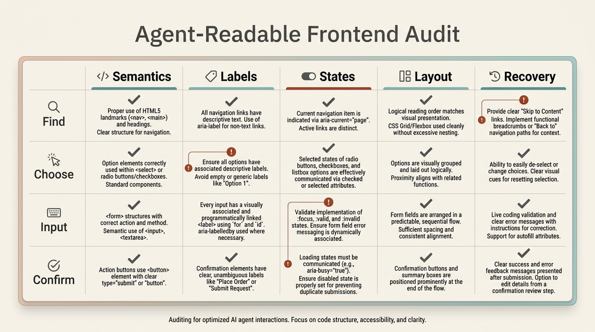
Caption: Score the task path, not just the page. Agent failures usually happen between steps.
Before and after: a cart item agents can actually understand
Here is a simplified example. The first version may look fine, but it is hostile to agents and keyboard users.
<div class="cart-item" onclick="openProduct('analytics-pro')">
  <div class="name">Analytics Pro</div>
  <div class="price">$49/month</div>
  <div class="remove" onclick="removeItem('analytics-pro')">x</div>
</div>
Problems:
- The whole card is clickable, so the remove action can conflict with navigation.
- The "x" is not a real button.
- There is no accessible label for the remove action.
- Keyboard focus and action state are unclear.
- An agent might click the wrong area and open the product instead of removing it.
A more agent-readable version:
<article class="cart-item" aria-labelledby="cart-analytics-pro-title">
  <h3 id="cart-analytics-pro-title">
    <a href="/products/analytics-pro">Analytics Pro</a>
  </h3>

  <p class="price">$49/month</p>

  <button
    type="button"
    class="remove-button"
    aria-label="Remove Analytics Pro from cart"
    onclick="removeItem('analytics-pro')"
  >
    <span aria-hidden="true">x</span>
  </button>
</article>
And the related CSS should keep the interaction visible:
.cart-item:focus-within {
  outline: 2px solid #2563eb;
  outline-offset: 4px;
}

.remove-button {
  cursor: pointer;
  min-width: 44px;
  min-height: 44px;
}

.remove-button:focus-visible {
  outline: 2px solid #dc2626;
  outline-offset: 2px;
}
This version gives the agent several clues. The product title is a link. The remove action is a button. The button says exactly what it removes. The focus state is visible. The hit target is large enough to click reliably.
A quick AEO checklist for frontend teams
Use this checklist before shipping high-value pages:
| Check | Pass condition |
|---|---|
| Semantic controls | Links are links, buttons are buttons, inputs have labels |
| Accessible names | Icon-only and repeated controls have specific |
| Focus order | Keyboard tab order follows the visible task path |
| Loading feedback | Async actions expose busy, disabled, waiting, or skeleton states |
| Error recovery | Errors are tied to fields and explain the next correction |
| Layout stability | Important controls do not jump after the agent decides to click |
| Overlay cleanup | Hidden modals and drawers do not intercept clicks |
| Task confirmation | Success states persist long enough to be observed |
| Content clarity | Pricing, plans, policies, and constraints are written in extractable text |
If you already run accessibility checks, extend them with agent task checks. Accessibility catches many of the structural problems. Agent testing catches workflow ambiguity.
How Auspia would audit this
At Auspia, we would not start by asking whether a page "looks AI-friendly." That question is too vague. We would start with tasks.
For example:
- Can an AI assistant find the correct plan for a 20-person team?
- Can it compare the free and paid limits without opening five tabs?
- Can it submit a demo request with required fields only?
- Can it recover from an invalid email address?
- Can it explain what happened after submission?
Then we would inspect the page through three layers: visible UI, structured HTML, and answer/task evidence. The Auspia tools hub is built around that same idea: traffic growth now depends on what humans, search systems, and AI agents can all understand.
Common mistakes
The most common mistake is treating agent optimization as a future problem. If agents are already browsing websites for research, shopping, support, and workflow automation, the future problem is already leaking into today's conversion paths.
The second mistake is overengineering. You do not need a separate agent-only API for every flow. APIs are useful, but browser agents will still encounter your public UI. Fixing semantic HTML, labels, states, and task clarity is cheaper and more durable.
The third mistake is optimizing only the homepage. Agents usually fail deeper in the journey: forms, filters, checkout, comparison tables, account setup, help centers, and pricing calculators.
The fourth mistake is hiding important information in images. If plan limits, terms, or feature comparisons live inside decorative graphics, the agent may miss them or quote them poorly. Put important facts in real text and use visuals to reinforce them.
What to do next
Pick one revenue-critical flow and run a small agent-readability sprint:
- List the user task in one sentence.
- Walk the flow with keyboard only.
- Inspect the accessibility tree for every action.
- Remove ambiguous clickable containers.
- Add labels to icon-only controls.
- Make loading, errors, and success states impossible to miss.
- Test the same task with a browser agent or automation script.
- Record where the agent hesitates, misclicks, retries, or loops.
That gives your team a practical starting metric: agent task completion rate. It will not replace conversion rate, Core Web Vitals, or accessibility compliance. But it may become one of the clearest signals that your site is ready for the next layer of web traffic.
FAQ
What is an agent-readable frontend?
An agent-readable frontend is a web interface that AI agents can understand and operate reliably. It uses semantic HTML, accessible labels, clear interaction states, stable layouts, and task-level confirmation so agents can click, type, wait, and recover with fewer mistakes.
Is this the same as accessibility?
Not exactly, but there is a large overlap. Accessibility improves the machine-readable structure of a page through roles, labels, focus behavior, and state. AI agents often benefit from the same signals, especially when they use the accessibility tree alongside screenshots.
Does every website need to optimize for AI agents now?
Every website does not need a full agent program immediately. But any site with important forms, pricing pages, ecommerce flows, dashboards, booking flows, or support journeys should start auditing high-value tasks. Those are the places where agent failures can affect revenue or customer experience.
Should we build a separate API for agents instead?
Sometimes, yes. APIs are useful for trusted integrations and structured workflows. But public browser agents will still interact with ordinary pages. A clean, semantic, accessible frontend remains valuable even when an API exists.
What metric should teams track?
Start with agent task completion rate for a small set of important workflows. Track whether the agent completes the task, where it fails, how many retries it needs, and whether the final state is correctly understood.