

Google tests advertiser names and favicons at top of mobile sponsored results
Google is testing a new layout for sponsored search results on mobile that puts advertiser names and favicons in a summary header above the actual ads. Digital marketing consultant Sachin Patel spotted the change this week. It appears when multiple advertisers are grouped together in a sponsored results block.
The details
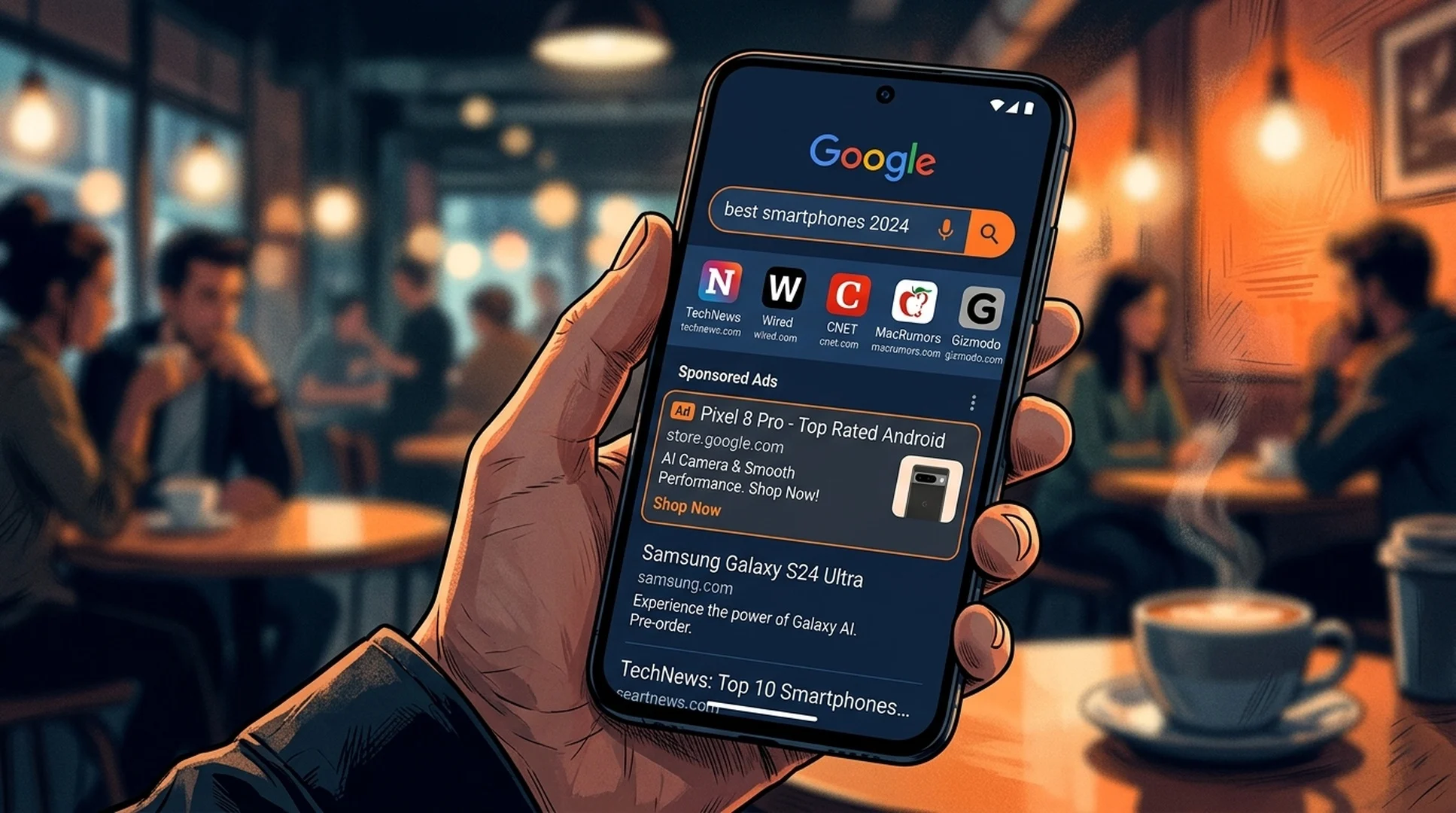
When Google groups two or more advertisers in a sponsored results section on mobile, the test puts a header directly beneath the "Sponsored results" label showing each advertiser's favicon and domain name. Users see this summary before they scroll down to the actual ad listings.
Patel shared screenshots on X showing the layout. In the screenshots, a sponsored results group contains two advertisers. At the very top of the ad block, directly under the "Sponsored results" header, Google displays the favicon and domain name of each advertiser that appears below. The effect is a kind of table of contents for the ads in that group.
The test ties into Google's ad grouping feature, which the company introduced to let users cluster related ads together and control whether they see them. With ad grouping, searchers can expand or collapse blocks of sponsored results. The summary header extends that system by showing upfront which advertisers are included in each group before users decide whether to engage.
Google hasn't announced the test publicly or given a timeline for rollout. Right now it's visible to a limited set of mobile searchers. The company frequently runs small-scale SERP tests before deciding whether to deploy features more broadly.
Background on ad grouping
Google introduced the ad grouping layout earlier in 2026 as part of its ongoing efforts to give users more control over their search experience. The feature lets Google cluster multiple ads from different advertisers into a single expandable block. Users can choose to view or hide the entire group.
The idea behind ad grouping is to reduce ad clutter while still showing relevant sponsored content. Instead of displaying three or four ads in a vertical stack, Google can collapse them into a single group that users expand if interested. The new summary header appears to address a potential downside of that approach: users might not know what's inside the group before deciding whether to expand it.
By showing advertiser names and favicons upfront, Google gives users enough information to make that decision without having to open the full ad block. It's a transparency move that could also serve Google's business interests. Users who know which brands are advertising might be more likely to engage with the group if they recognize or trust those brands.
The approach mirrors patterns Google has tested elsewhere in the search experience. Rich results and featured snippets already give users previews of content before they click through. Applying that same preview logic to ads represents a shift in how Google frames sponsored content on the page.
Why this matters for SEO and AI visibility
SERP layout changes shift the visual balance between organic and paid results. When Google makes ads look more prominent or trustworthy through favicon displays and advertiser summaries, it can pull user attention and clicks away from organic listings.
The favicon element is particularly worth noting. Favicons are visual markers that users associate with specific brands. Seeing recognizable brand icons in the ad header could make sponsored results feel more legitimate and less like generic advertising. That perception shift could affect how users distribute their attention between the ad block and organic results below it.
SEO teams watching mobile search performance should track whether this test spreads. Changes to how sponsored results display often preview where Google is heading with the search experience overall. If the summary header makes ads more visually distinct or credible, organic results face stiffer competition for attention in the mobile SERP.
Google is also experimenting with ad transparency more broadly. Showing users which advertisers appear before they scroll tests whether upfront disclosure builds trust and boosts engagement with sponsored content. This aligns with regulatory pressure in some markets requiring clearer separation and labeling of advertising.
What to watch next
Search marketers should keep an eye on their own mobile SERPs for this feature. If Google expands the test, it could stick around permanently. The company usually runs these tests for weeks or months before deciding on full deployment.
Data on click-through rates will matter. If the summary header improves ad performance, Google has every reason to roll it out widely. If it doesn't move the needle or hurts engagement, it'll likely get shelved.
Mobile has been Google's go-to testing ground for SERP features that eventually show up on desktop. This test arrives as the company keeps adjusting how paid results sit alongside organic listings and AI-generated content. The mobile SERP continues to evolve as Google balances advertiser interests, user experience, and its own revenue goals.
Sources
- Screenshots and observations shared by Sachin Patel on X (August 2026)
- Google Ads ad grouping layout documentation